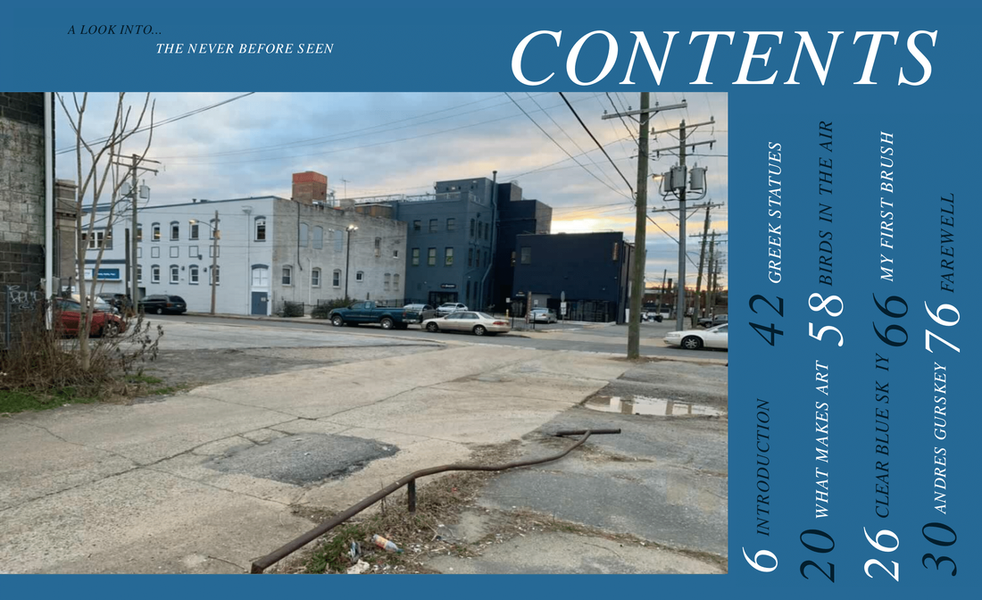
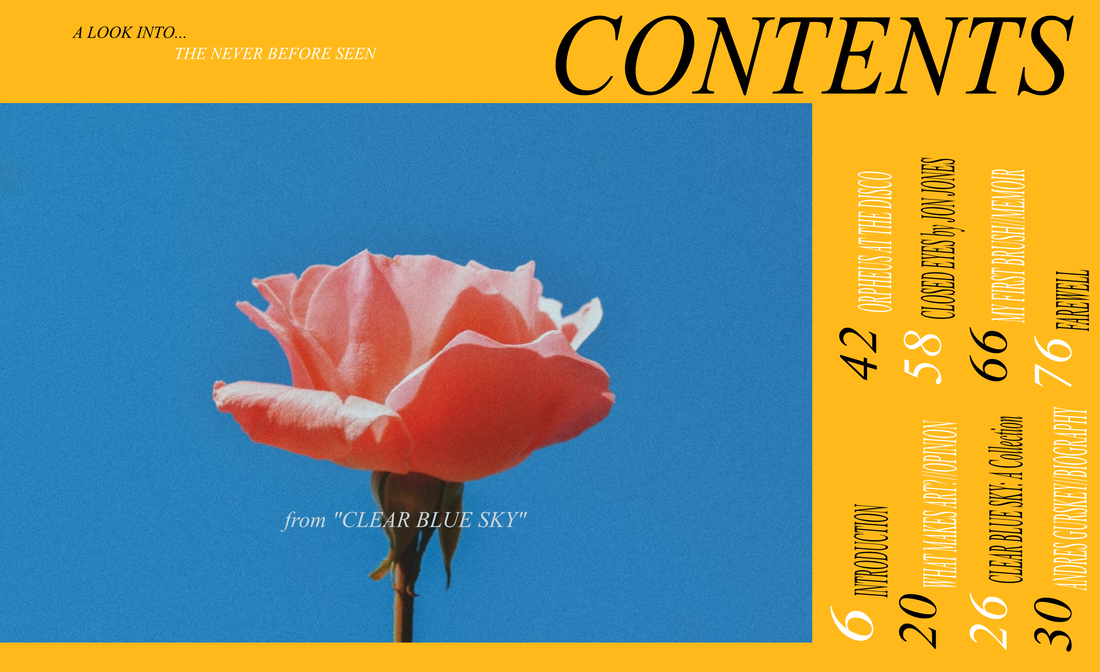
 Here is the evolution of my table of contents from first draft to final. I wanted to start with a table of contents that mirrored the color scheme of my cover. At this point I decided to use a picture of a rose as the main image in the TOC. I also added in a caption on the image to show the reader the fictional article or exhibit it would be from. It is important to note that I had no intention of using this rose in my final product, and I also had no intention as claiming it as one of my own works. I simply used it as a place holder. I wanted to have a very eyepopping and unique layout for my TOC, so I experimented with the placement, size and colors of the text. The majority of the titles on this table of contents are fictional contents, made by fictional people. The only two exceptions is the ficitonal biographer on real life artist Andres Gurseky, and "Clear Blue Sk IY" the name of a group of painters/photgraphers that I am a member of (I had no say in the naming of this group, and frankly, I find this name to be quite tasteless". In the first two revisions, I had accidentally spelt it as "Clear Blue Sky". Quite ironic how the correct spelling of these words ended up being the wrong way to write this group's name.
|
 | 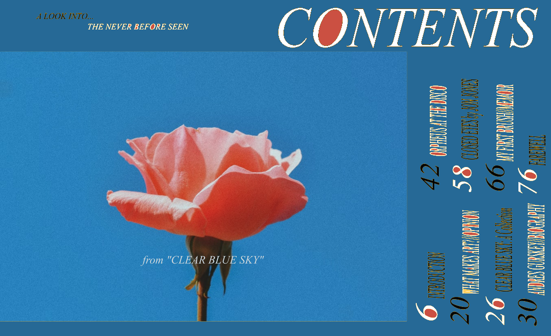 |
-Changed main color to dark blue to fit new theme/picture.
-Contents title changed to white because it popped out more than black.
-Certain letters filled in with a color from the rose for aesthetics.
-grey line on the bottom of the image for no particular reason. I thought it looked nice.
Unfortunately for me, the original editable file for this was in my laptop before it broke. I had to use photoshop to revise this page.
Image Used:
Joshi, Saraubh. “Rose Stock Photo.” IStock, 28 Nov. 2020, www.istockphoto.com/photo/rose-gm1287713034-383853169?irgwc=1&cid=IS&utm_medium=affiliate&utm_source=TinEye&clickid=w4zQRYWumxyLTNE0TbWK8Xs3UkBx0vWpRSjW380&utm_term=&utm_campaign=&utm_content=435504&irpid=77643.
 |  |
 RSS Feed
